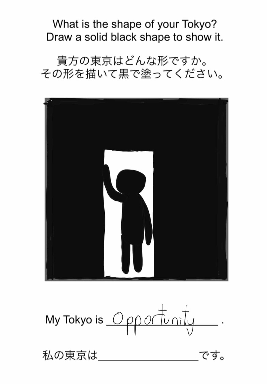
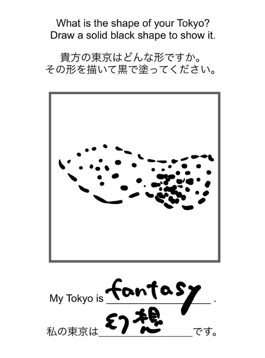
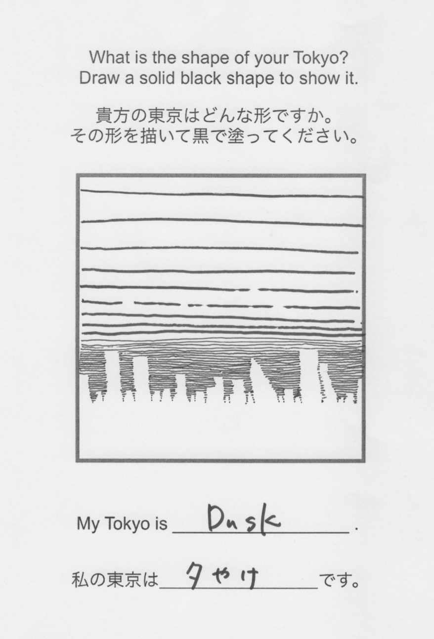
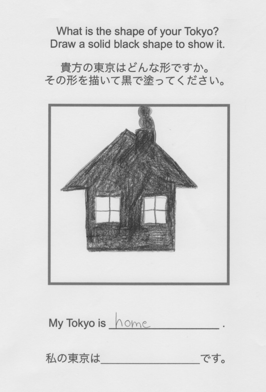
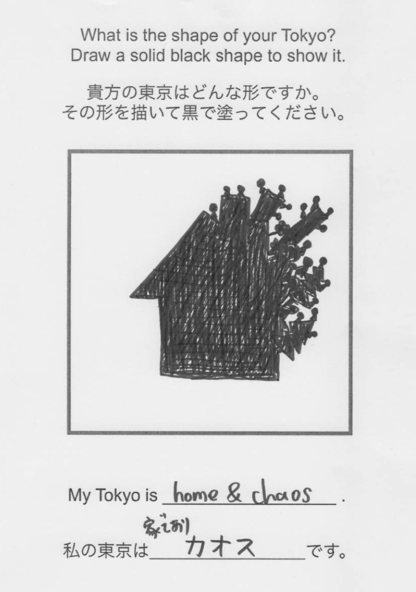
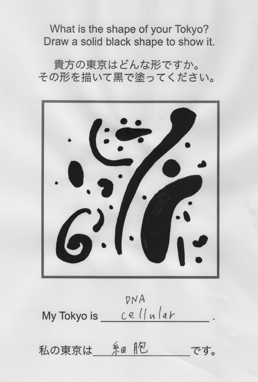
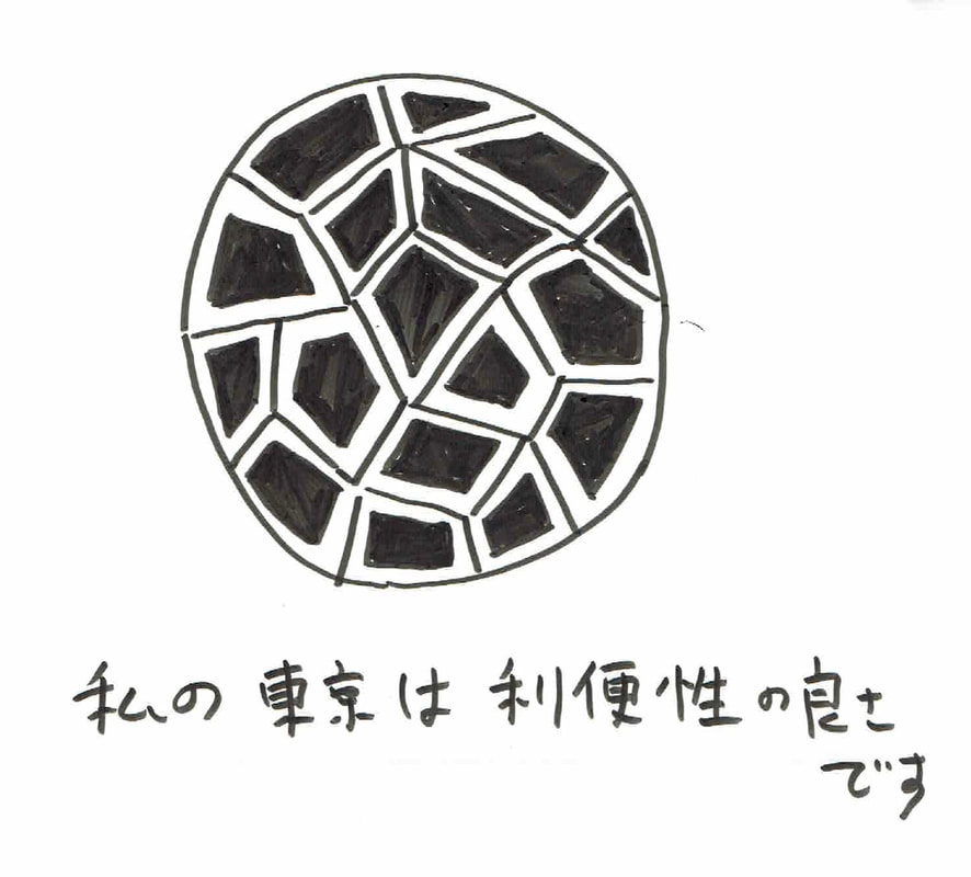
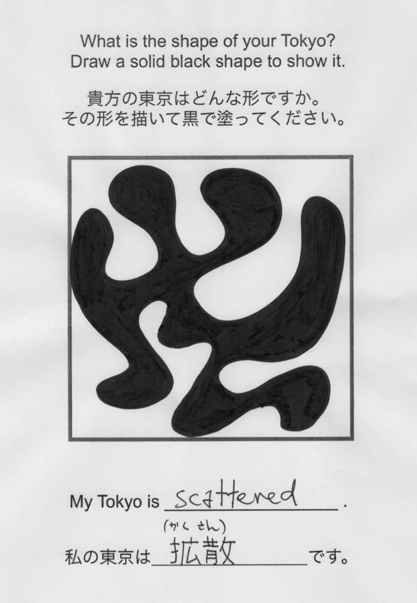
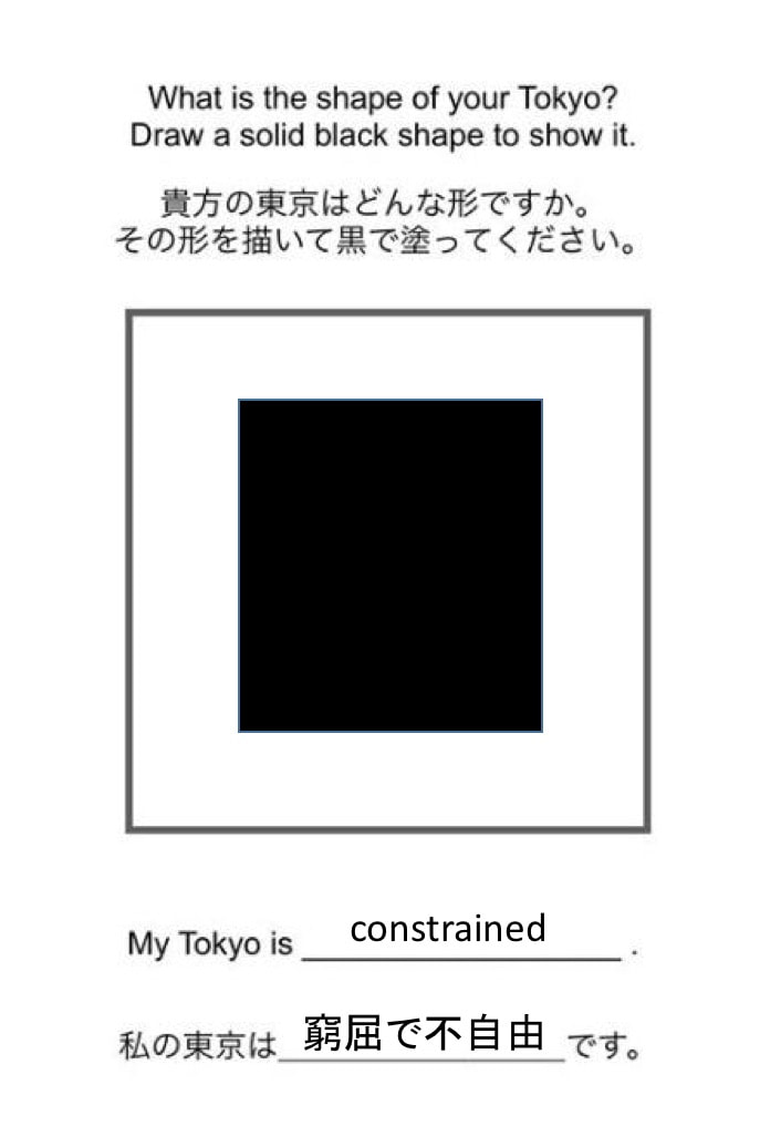
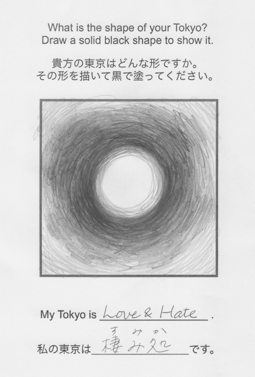
Third Space Tokyo now has a company color, but we started out with the idea that we would have a logo with a unique symbol. We wanted our symbol to represent more than just a 2-person understanding of Tokyo, and so we reached out to a small number of acquaintances. I'll explain our conclusion after you've scrolled through them. What do you notice?
We noticed most of all the wide range of answers, sometimes within the thinking of a single person. Tokyo can be both constrained and scattered, home and chaos, love and hate. It is the visible experience of dusk and a fantasy. With this wide range of answers emerging from just a few people, we decided that we would not make any permanent mark, any symbolic logo, showing what Third Space Tokyo might be.
Instead, we chose a color -- a color that just happens to have the name "rouge sangre" (blood red). This felt right. The activities of Third Space Tokyo are always co-created by the humans involved, all of whom share the same red blood.
Instead, we chose a color -- a color that just happens to have the name "rouge sangre" (blood red). This felt right. The activities of Third Space Tokyo are always co-created by the humans involved, all of whom share the same red blood.
Special thanks to Seiji Tarumi who guided us through the design process.
Thanks also to all fellow Tokyo residents who shared their drawings and words.
Thanks also to all fellow Tokyo residents who shared their drawings and words.

 RSS Feed